Retail · Web design
Meridian Express
Groceries sell on appetite. The homepage should too.
- Role
- UI/UX Designer
- Tools
- Figma
- Year
- 2023
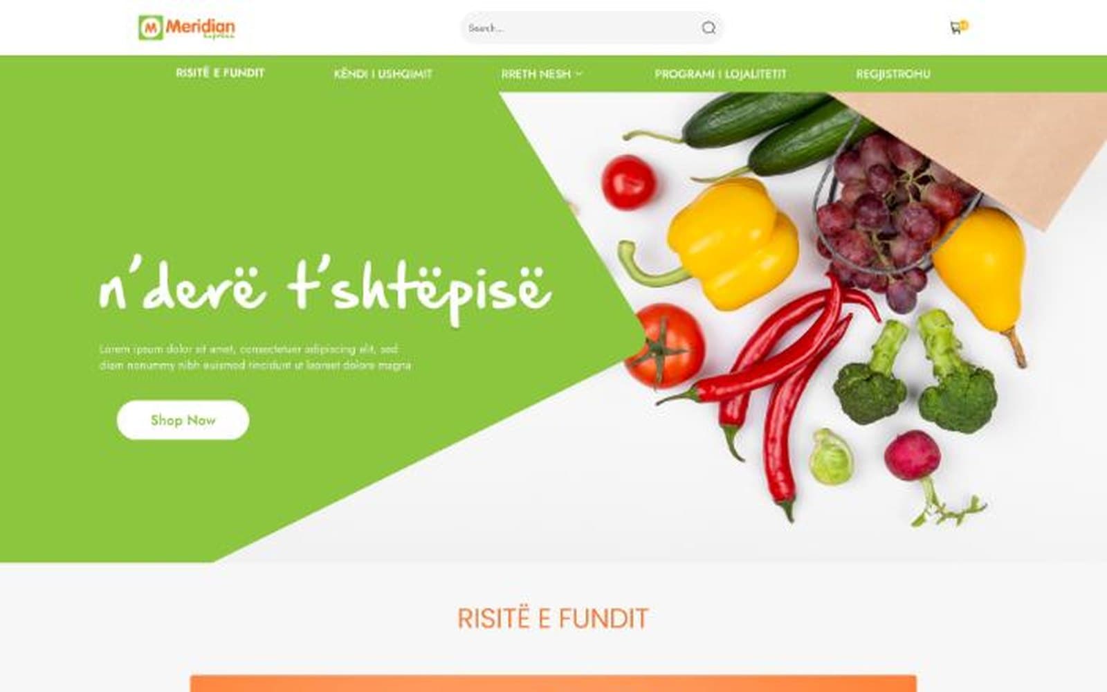
Groceries to your door, n’derë t’shtëpisë, as the hero puts it. They sell on appetite and habit, so the page makes you hungry first and makes ordering forgettable.
Under that, the most systematic build of the set. The first time I assembled a design from named tokens instead of one decision at a time.
- 7
- colour styles in the token set
- 2
- text styles: Title and Body
- 1920
- desktop grid style
- 2
- effect styles: shadow and border
How this project was made
The artifacts on this page, in the order they were produced. Each pill jumps to its section.
- 1
Discover
- Not part of this project
- 2
Define
- 3
Design
- 4
Deliver
- 5
Evaluate
What mattered
The decisions that shaped everything below.
Tokens, not screens
Seven colour styles, two text styles, two effect styles. Everything after that is assembly, and the developer inherits names instead of hex codes.
Appetite before information
Food shot close and warm. A hand reaching for fruit, a bag spilling over. Produce sells produce. A promo banner never has.
Offers that survive the week
New arrivals, weekly offers and testimonials repeat from the same components, so merchandising swaps the contents and never the layout.
User flow
The steps a person takes to finish the one job this design protects.
- 1TemptGreen diagonal, produce spilling, one line: to your door.
- 2DiscoverNew arrivals surface what just landed in store.
- 3BrowseCategory menus, split the way people actually shop.
- 4TrustWhat customers say, in their own words.
- 5ReturnLoyalty and sign up make the next visit the default.
Red route.The weekly offer is the engine. The layout exists to surface it.
Colour
The palette and what each family is allowed to do.
- Primary 1#87C749
- Primary 2#B6DC85
- Secondary#F89050
- Complementary#4A8CDC
- Warning#713526
- Background#FFFFFF
Type
The typeface, shown at the sizes it ships at.
Two text styles exist in the whole file. Title, and Body. That constraint is why the layouts stay calm while the photography gets loud.
- 1
Hero slider
Full bleed food frames carrying the week’s headline offer.
- 2
Product tile
One tile, fed by the tokens, across every row.
- 3
Elevation & border
Two effect styles. No card invents its own shadow.
- 4
Testimonial row
Customer quotes, repeating, under the merchandising.
UI screens
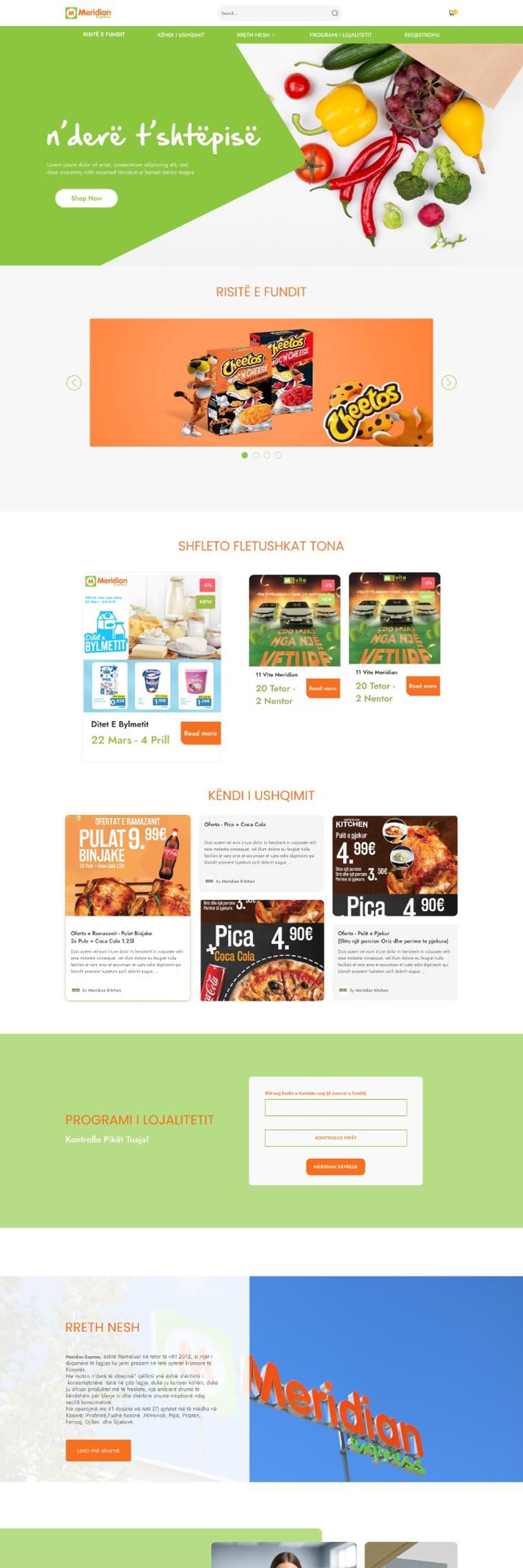
The shipped screens, with the details worth a second look numbered.
Outcomes
What shipped, and where it lives.
- Ecommerce storefront: search, cart, delivery
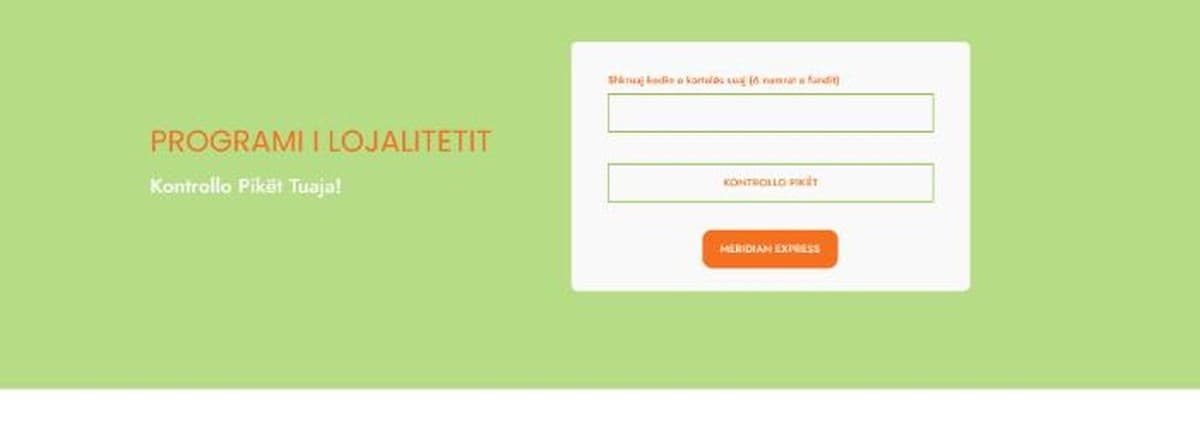
- Loyalty program built into the navigation
- Full token system handed to developers
Two text styles and seven colours. The constraint is the system.