B2B SaaS · Product & Web
Attributy
If the budget decision is hard, the interface should not be.
- Role
- UI/UX Designer & Creative Lead
- Tools
- Figma · Figma Motion · Photoshop
- Year
- 2025 to now
- Live
- Visit site ↗
Attributy reconciles every channel a company spends on, online and offline, into one view of what drove revenue. Its buyers arrive sceptical. Every vendor promises them the same thing.
I lead design here: the site end to end and the product interface beside it. Around fifty pages, still growing.
- 50
- pages across the site architecture
- 20
- product pages, one per capability
- 10
- solutions pages by industry and role
- 13
- ad platform integrations documented
How this project was made
The artifacts on this page, in the order they were produced. Each pill jumps to its section.
- 1
Discover
- 2
Define
- 3
Design
- 4
Deliver
- 5
Evaluate
Competitive analysis
Who else sells this, what they show, and where the gap is.
| Features |  Fospha Fospha |  Cometly Cometly |  Triple Whale Triple Whale |  Northbeam Northbeam |  Ruler Analytics Ruler Analytics |
|---|---|---|---|---|---|
| Core features |
|
|
|
|
|
| Model |
|
|
|
|
|
| Strengths |
|
|
|
|
|
| Weaknesses |
|
|
|
|
|
| Gap for Attributy |
|
|
|
|
|
Landscape read, September 2026, from the public sites. Strengths and weaknesses are about what each site shows a buyer, not about the products' results. Measured.com was unreachable when I ran this and is left out.
UX benchmarking
The same job, on competitors' own pages, with the details that decided my direction marked.
Homepage proof
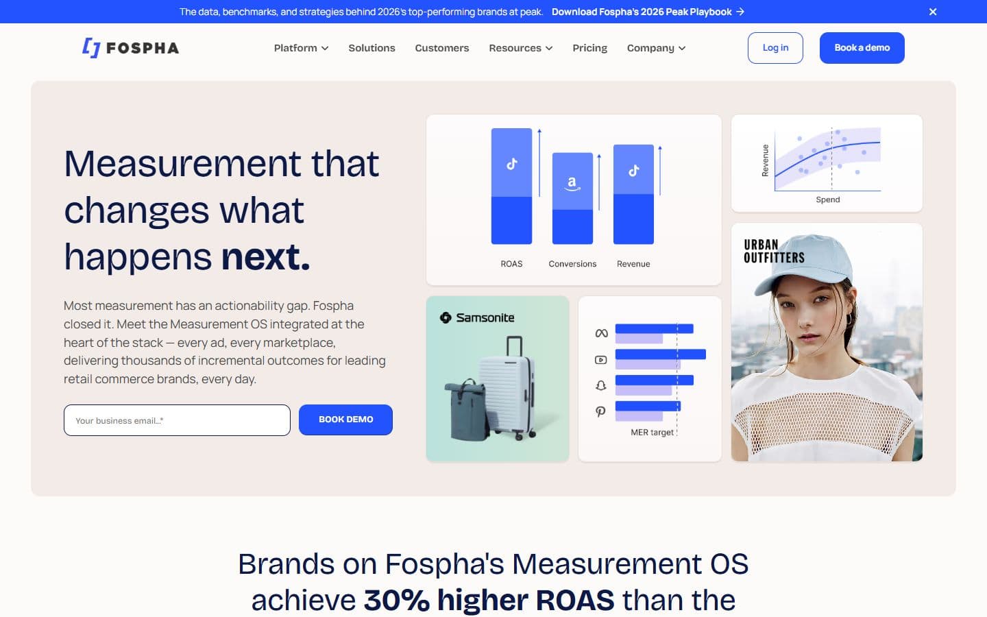
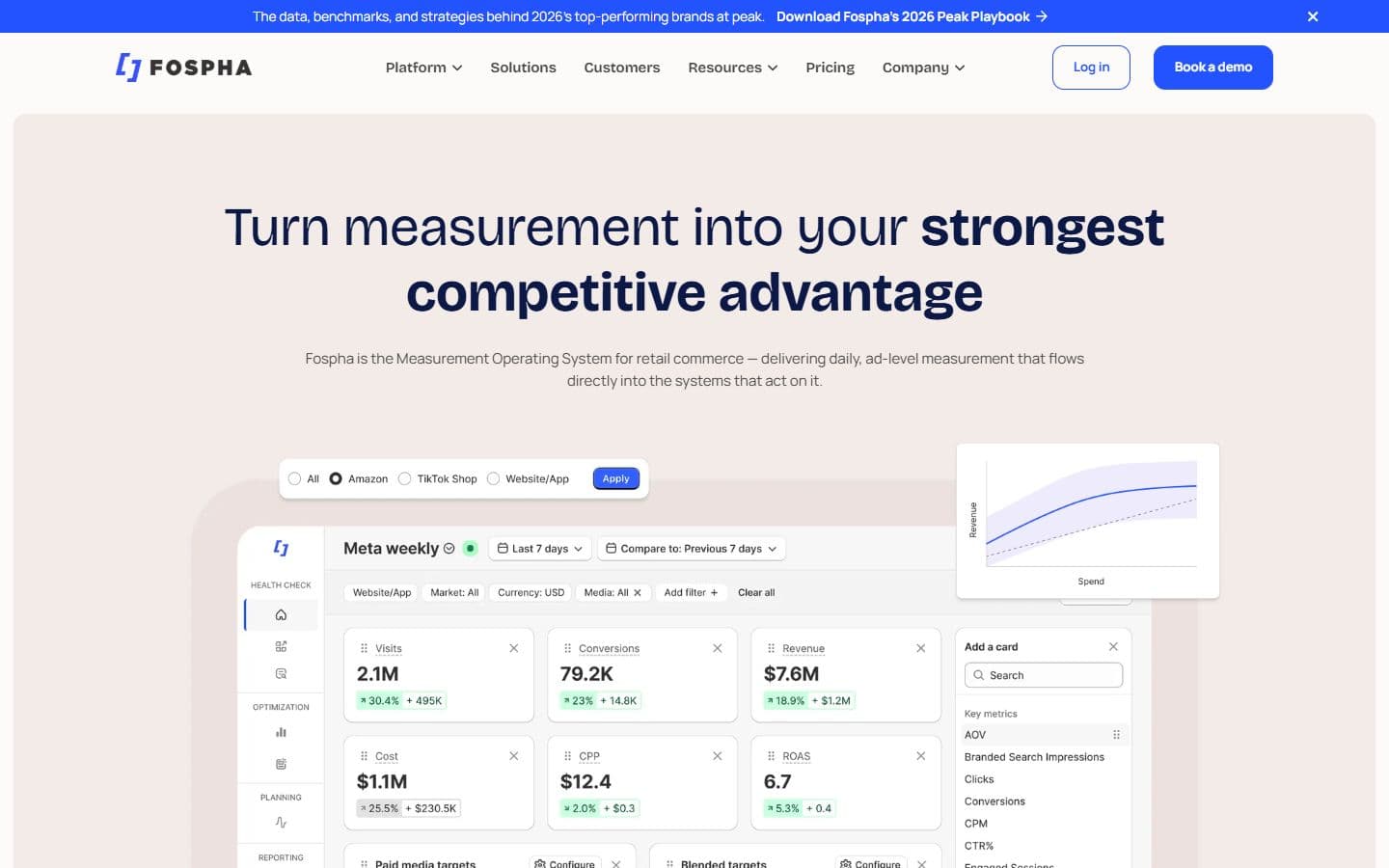
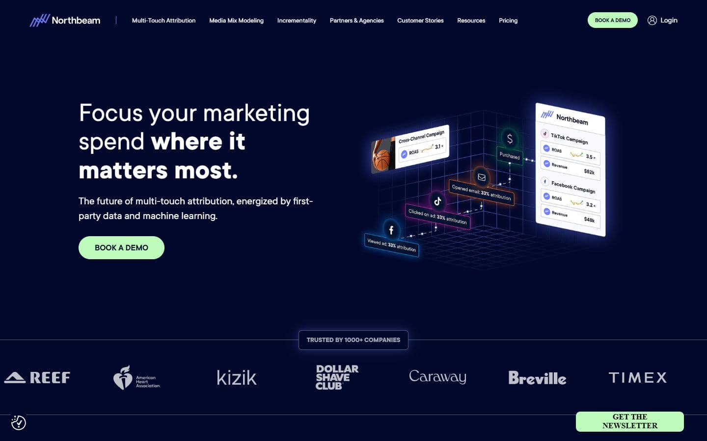
- Fospha shows results as chart tiles and brand photography, not the interface. A one field email form sits in the hero.
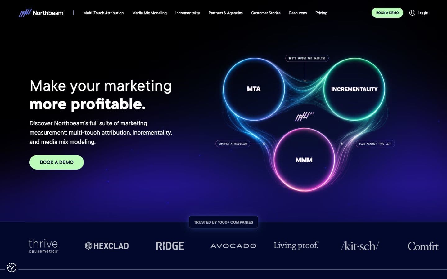
- Northbeam opens with a diagram of three model names and one button. The product waits on the inner pages.
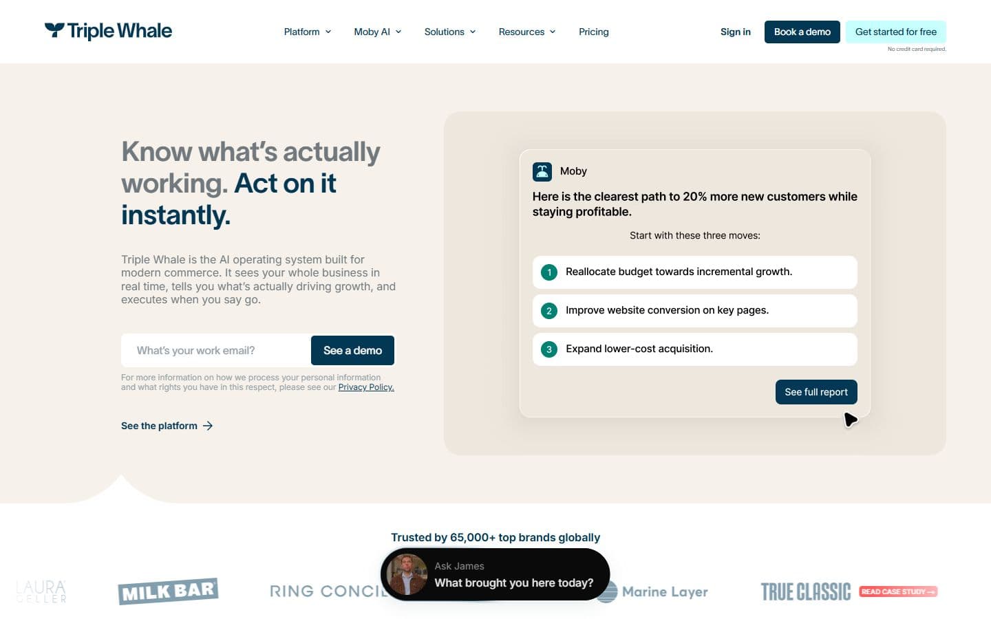
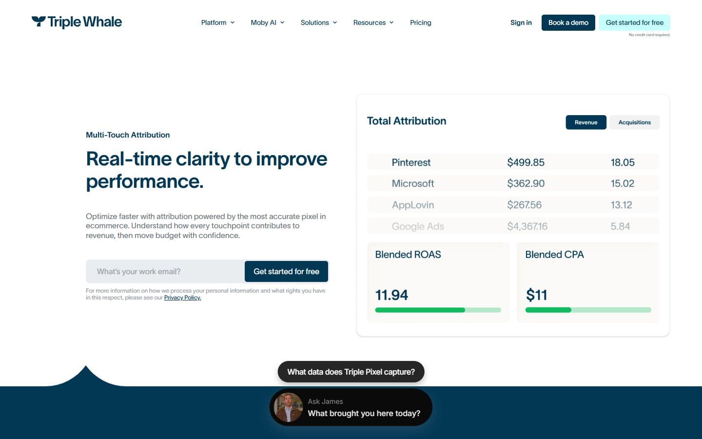
- Triple Whale puts its AI assistant's answer card in the hero, next to an inline email field. The screen is the pitch.
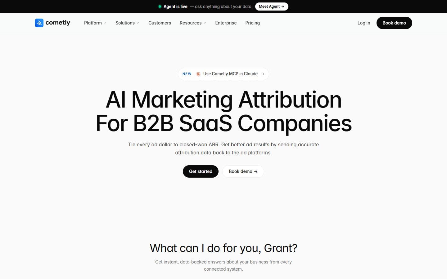
- Cometly leads with a headline and two buttons. Nothing of the product above the fold.
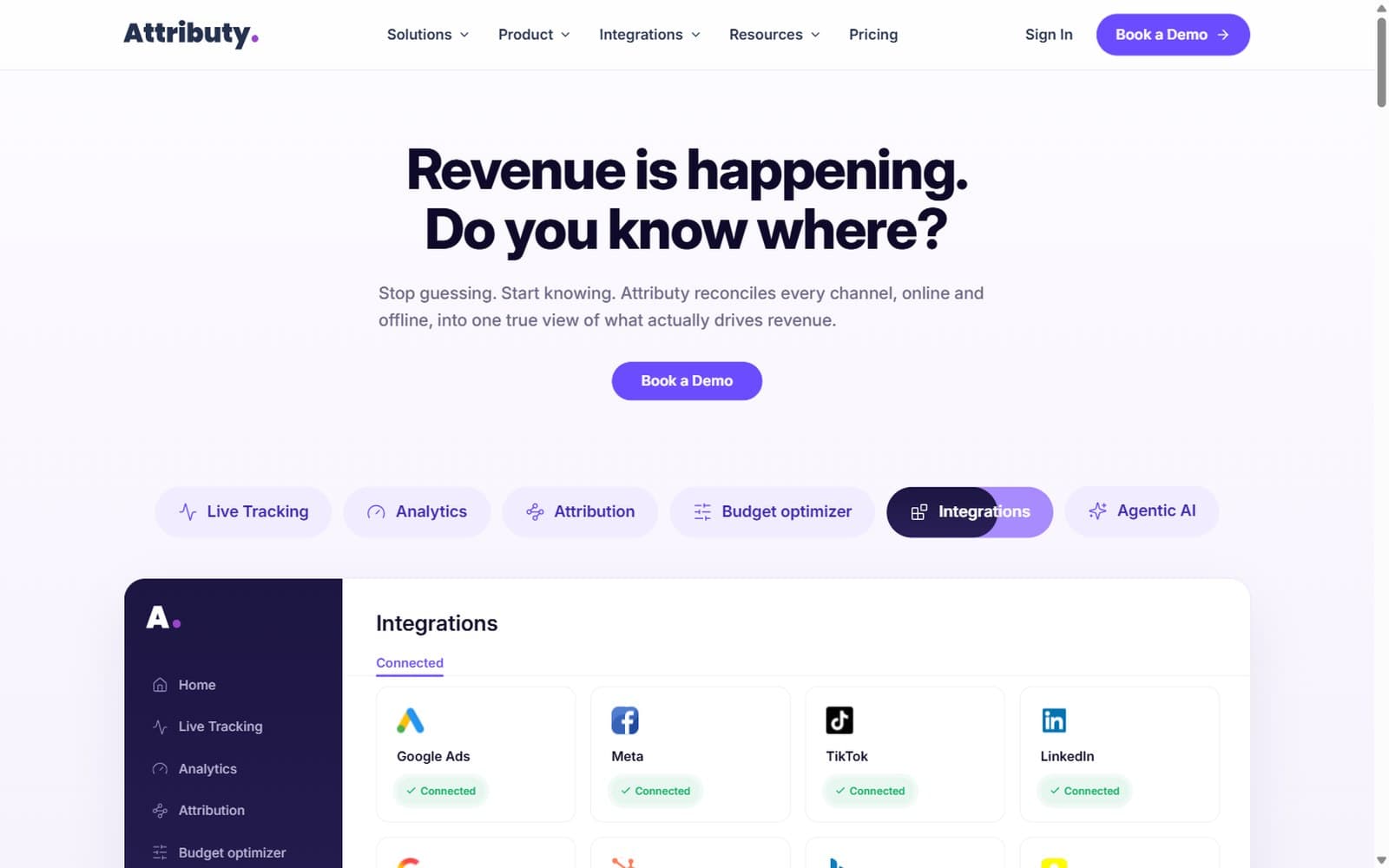
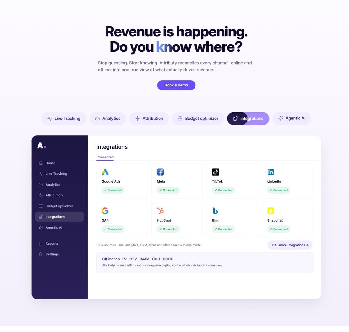
Six real platform views on a tab switcher, directly under the question. The product is the proof.
The demo path
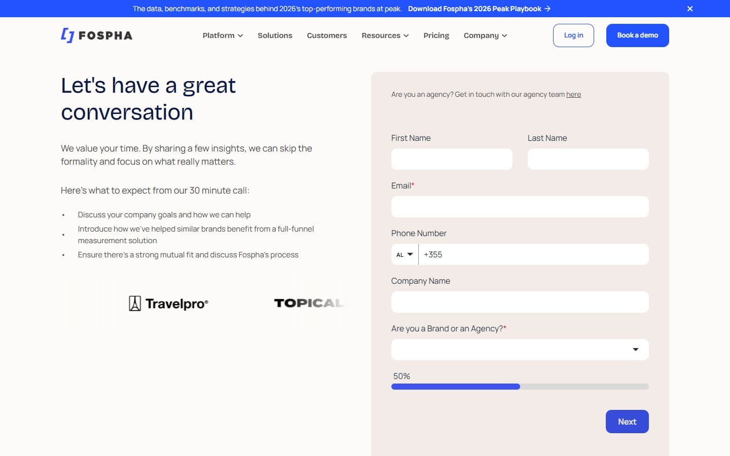
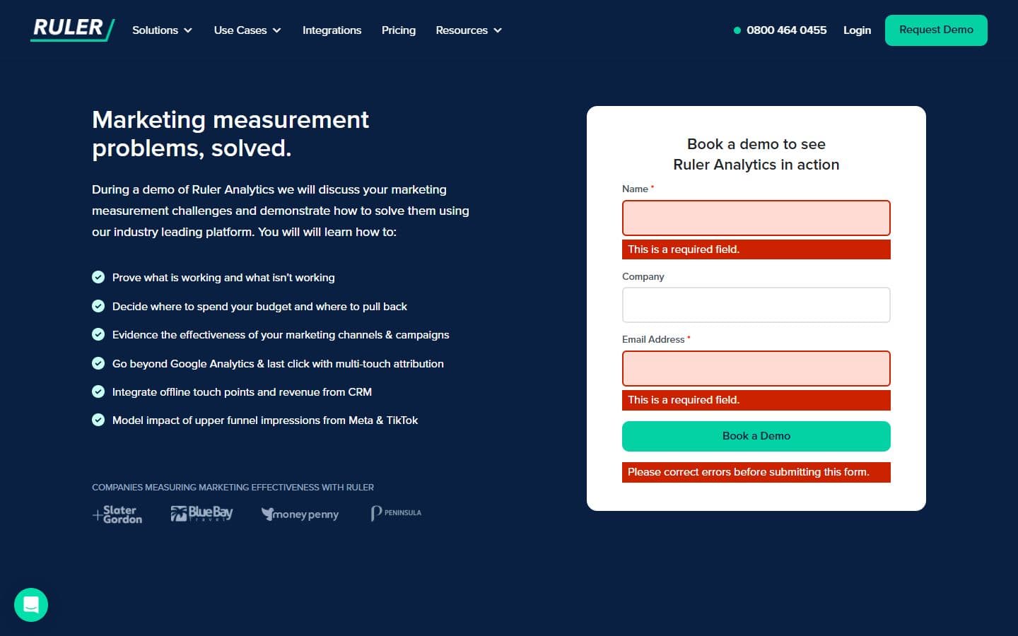
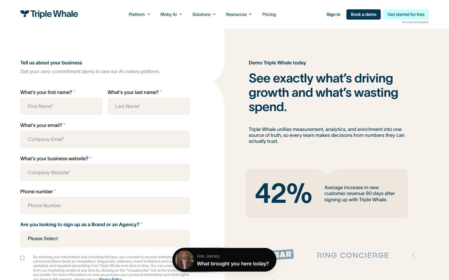
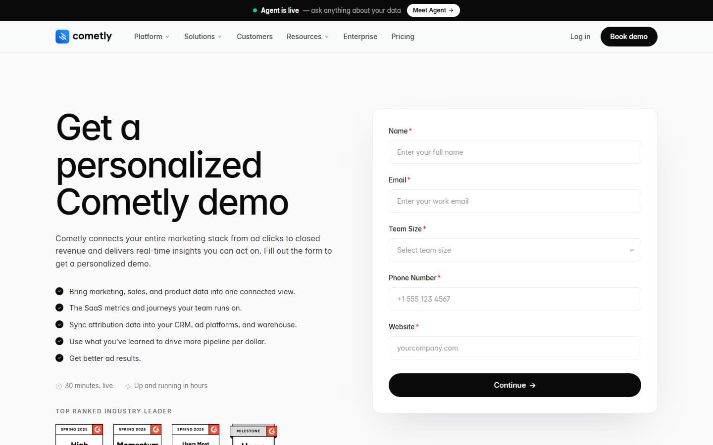
- Every competitor gates the demo behind five or six required fields. A phone number is required on three of them.
- Fospha splits the form in two steps and shows a progress bar, so the ask feels shorter than it is.
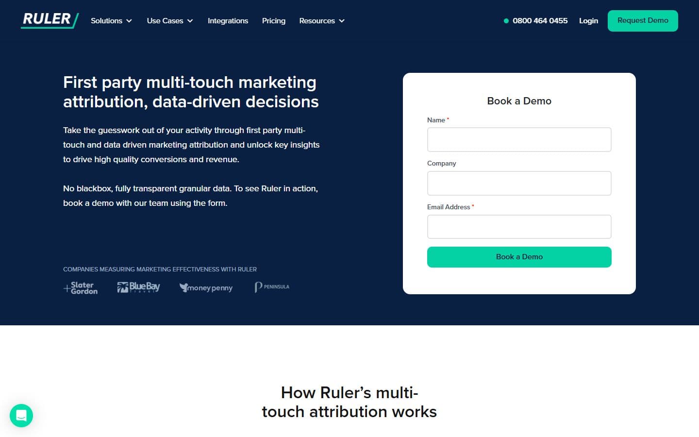
- Ruler asks for a name, a company and an email. Nothing else. The shortest path in the set.
- Northbeam and Cometly write what the thirty minutes will cover next to the form.
Book a Demo rides the nav on every page, so the ask is never more than one click away, and the page says what the call covers before it asks for anything.
Explaining one capability
- Fospha and Triple Whale put a real screen next to the capability's headline.
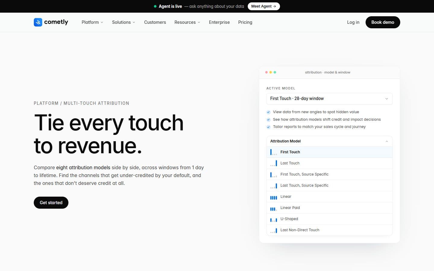
- Cometly shows a single control, the attribution model picker. One control explains the feature better than a whole dashboard would.
- Northbeam illustrates the capability with an isometric drawing of cards. Handsome, not the product.
- Ruler opens the capability page on the demo form, before any screen. All five run one template across their product pages.
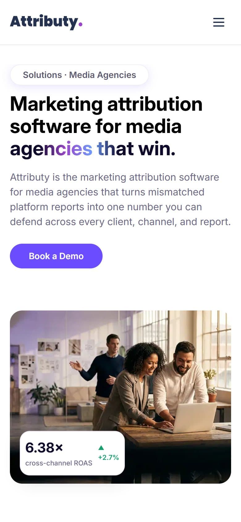
One skeleton for twenty product pages: the capability, the real screen, the question it answers, the demo.
Benchmarking takeaways
Three things the landscape made obvious.
- 1
Everyone promises one view of revenue. Almost no one shows the screen where it happens.
Four of the five homepages open with a headline, a diagram or a chart. The interface, the thing a buyer will live in, arrives a scroll or a click later.
- 2
The demo form is where the buyer decides how much to trust you.
Five or six required fields is the norm, phone number included. Ruler's three field form is the exception, and it reads as confidence.
- 3
Capability pages are a system, not a page.
Every competitor runs one template across its product pages. The difference is what goes in the visual slot: a real screen, one control, or an illustration.
What mattered
The decisions that shaped everything below.
Show the product, do not describe it
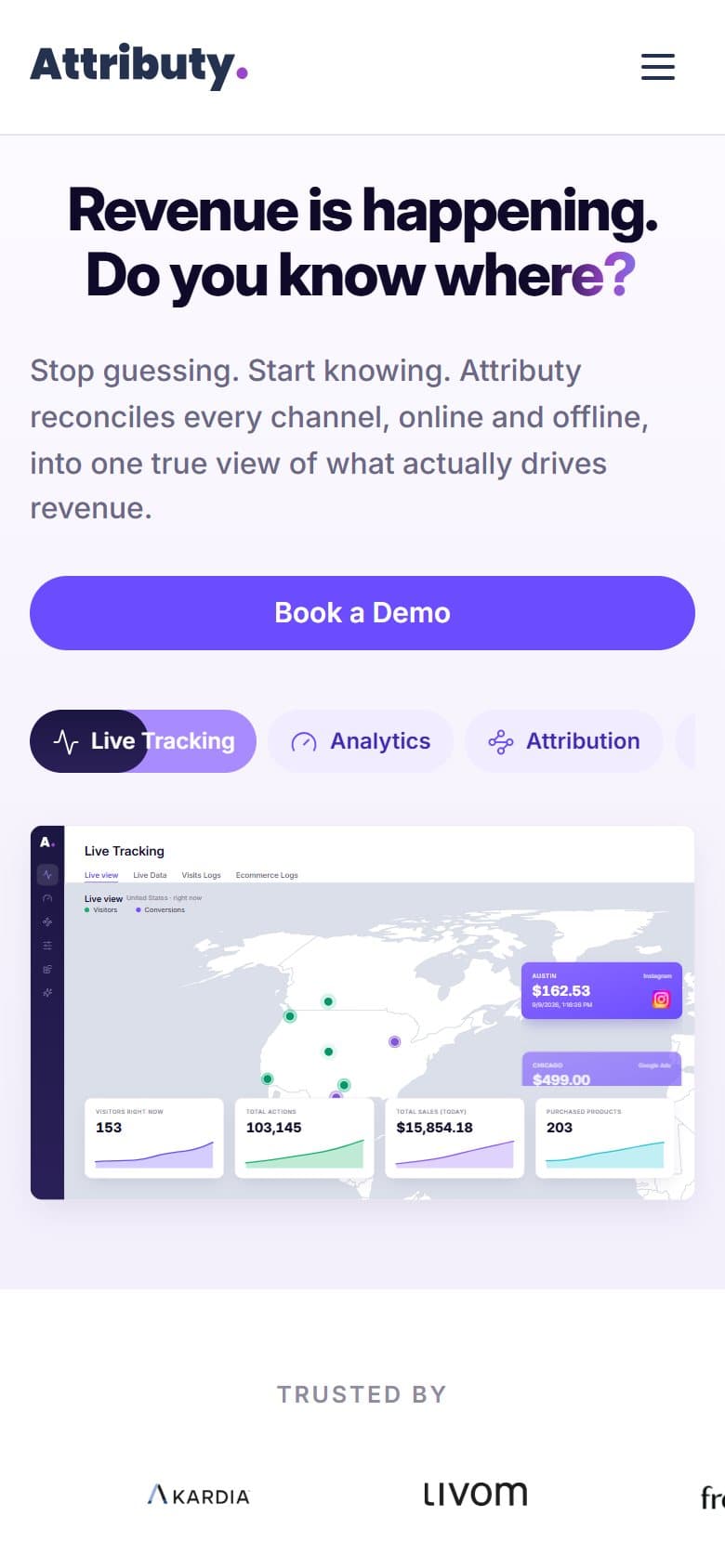
Six real platform views on a tab switcher, directly under the headline. No diagram of arrows and clouds standing in for the interface.
One question, in their words
“Revenue is happening. Do you know where?” They are already asking themselves that. Everything under the line is evidence.
Built to outgrow me
Twenty product pages, ten solutions, thirteen integrations. Each family shares one skeleton, so marketing ships a new page without a designer.
Answers, not dashboards
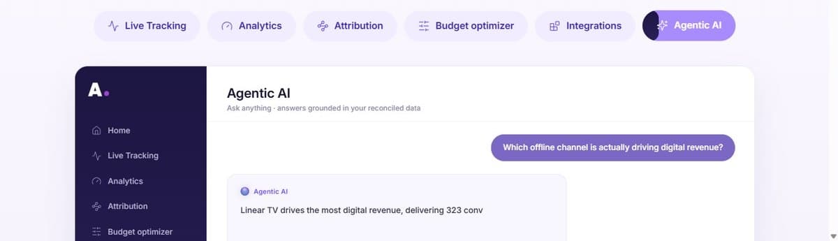
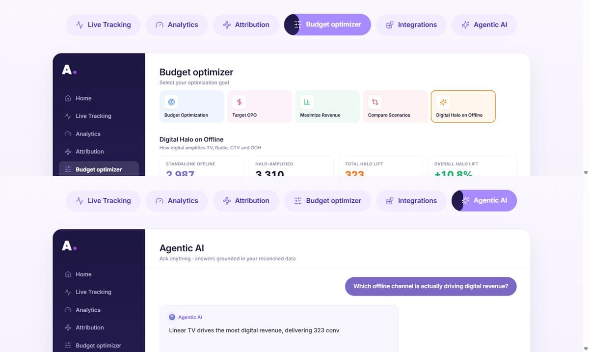
Ask the Agentic AI view which offline channel drives digital revenue and it answers in a sentence, numbers underneath. The table is still there for the analysts.
What I would measure
Success, written down before the screens, so the design has something to answer to.
Demo requests from product pages
Share of demo forms started on a product page rather than the homepage. Tells me whether the capability pages sell or only explain.
Tab switcher engagement
Share of homepage visitors who open a second product tab. The switcher is the proof. If nobody clicks, it is decoration.
Scroll to proof
Share of visitors who reach the logos and case studies. If the hero answers the question, they keep going.
Time to first product view
Seconds between landing and the first real screen on the page. The design's job is to make this small.
Pages shipped without a designer
New product, solutions and integration pages that marketing publishes on the templates alone. The system works if this number grows.
User flow
The steps a person takes to finish the one job this design protects.
- 1Land
- 2The question
- 3Product tabs
- 4Solutions page
- 5Proof
- Convinced?
- yes
- Book a Demo
- Confirmation
- no
- Pricing
- Resources
Red route.Everything is measured against one action: booking the demo. The site earns it, the product proves it.
Structure before styling
Hierarchy and placement on the key screens, drawn as blocks so the layout can be judged without the colour.
Structure, drawn from the shipped screens. Blocks are measured from attributy.com at 1440 wide in September 2026, not from early sketches.
Colour
The palette and what each family is allowed to do.
Purple
The brand family, as a scale. Full saturation is reserved for the one primary action per section. Tints carry the presence.
- #3F29B3
- #5A3DE6
- #6B4CFF
- #8C6FFF
- #B8A3FF
- #D9CCFF
- #ECE5FF
- #F6F3FF
Ink
Text and structure. The neutrals do most of the work so the purple can mean something.
- #0D0A1F
- #2A2440
- #6B6786
- #A09CB8
- #ECE8F5
- #FBFAFF
Support
Semantic only. Green for a positive delta or a confirmation, coral for attention, blue for information.
- #1FB364
- #E8744A
- #3A6DF0
Type
The typeface, shown at the sizes it ships at.
Revenue is happening. Do you know where?
- Sans serif
- Variable
- Tight display
Inter
Stop guessing. Start knowing. Attributy reconciles every channel, online and offline, into one true view of what actually drives revenue.
One family for the whole site. Display runs at 58 with tracking pulled to minus 1.5 so a long sentence lands as one object. Body sits at 17.5 with air, because this subject needs paragraphs.
- 1
Product tab switcher
Six labelled tabs, real screens, one frame. The homepage centrepiece.
- 2
Platform shell
Dark sidebar, light workspace, one navigation across all five product views.
- 3
Page templates
Three skeletons holding fifty pages in line as the site grows.
- 4
Insight card
One reconciled number and the comparison behind it.
UI screens
The shipped screens, with the details worth a second look numbered.
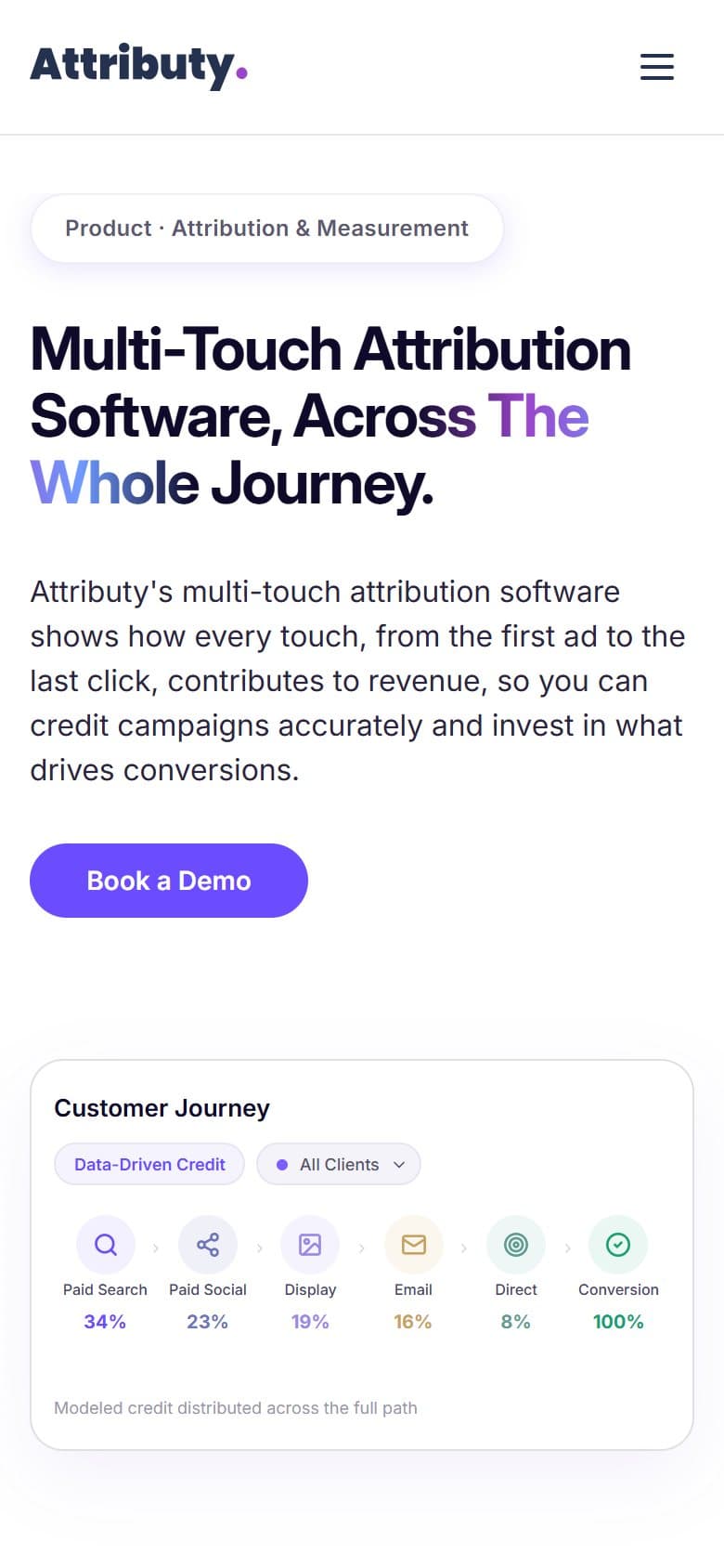
- 1The question in the buyer's words, before any feature.
- 2Book a Demo, the one action every page is measured against.
- 3Six real platform views on one tab switcher. No diagram standing in for the product.
- 4Offline channels sit in the same model as digital. The line the ecommerce tools cannot write.
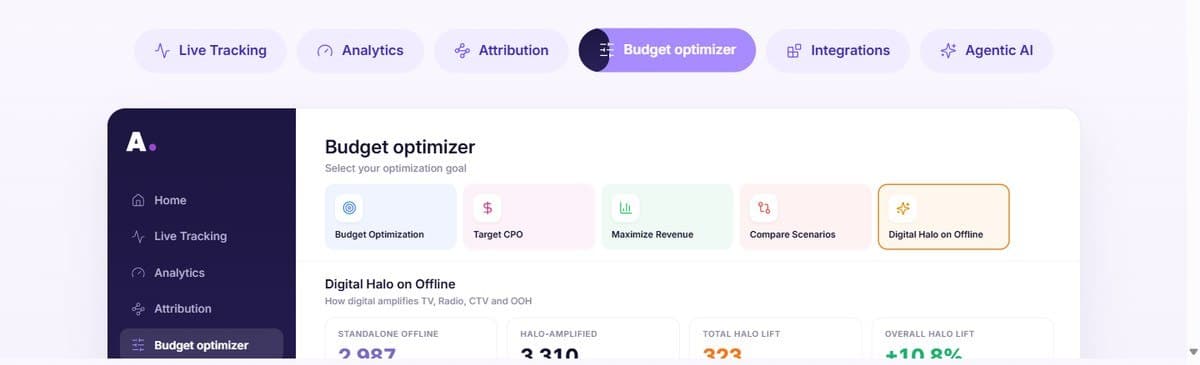
- 1Five goals as cards, one selected. The optimizer starts from a business question, not a chart.
- 2Dark sidebar, light workspace: one shell across every product view.
- 3Lift in green, the number itself in ink. Colour marks the delta, not the value.
- 1The question, in plain language, in a purple bubble.
- 2The answer in a sentence: which offline channel drives digital revenue. The numbers follow underneath.
The same pages at phone width.

Outcomes
What shipped, and where it lives.
- Live at attributy.com
- Around 50 pages across product, solutions and resources
- Product UI plus the marketing site
- Visit the live site ↗
Attribution is an argument about where money went. My job was to make that argument readable in one screen.